 When I heard that the Chinese Lantern Festival was coming to the NYS Fairgrounds, I knew I had to check it out! Traditionally, the Chinese Lantern Festival takes place at the end of the Chinese Spring Festival (aka Chinese New Year Festival), on the night of the first full moon of the Chinese calendar (typically in February or March). The exhibit set up at the State Fairgrounds ran from April 14 through June 24, 2017 which allowed visitors 2 months to attend and appreciate the history behind the larger than life lanterns. The festival consisted of more than 30 lit up displays aligned along a mile-long path around a small pond that attendees could walk, take photos, and read informational placards in order to learn more about the significance of some of the lantern displays. There are also nightly stage performances that consist of acrobatic contortion, plate spinning, and face changing.
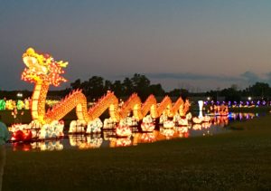
On June 21st, two of my daughters and I headed out to the Fairgrounds, in Syracuse to attend the New York State Chinese Lantern Festival. It was something that I had been wanting to do all Spring and with the festival ending in 3 days, it was now or never…. (or in August, when I heard that it may return for the NYS Fair). We got there shortly before 8:30 in the evening so that it was early enough to see any stage performances but late enough to enjoy the sculptures fully lit up in the dark. As we drove up to the parking lot, it was impossible to miss the huge 200-foot lit up orange dragon that appeared to be swimming in the center of a pond. Along the outskirts of the pond, dozens of other lit up animals such as penguins, elephants, and giraffes surrounded the dragon. It was a magical sight that took my breath away!
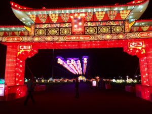 The festival welcomes you as you pass under a giant red welcome gate that resembles a traditional Chinese building. Along with the bright red columns, the gate is decorated with brown, yellow and teal-green designs. Once passing under the welcome gate, you walk beneath a corridor of white lanterns with orange foliage painted on them, hanging from rings of purple lights intricately woven into whimsical circles.
 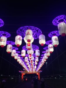 When walking through this beautiful corridor, it feels as though you’re about to be transported to another world. A colorful field of vibrantly lit decorations lay on the other side of the magical corridor that make it difficult not to get excited about. The very first thing that grabs your attention again is the mammoth dragon in the middle of the pond. It’s bright orange body with fire red scales beckons visitors to come to the edge of the pond to see it. Before we could get pulled into its mesmerizing trance, we were distracted by the sounds of what I’d consider to be traditional Chinese music and the applause of an audience. To our left, was a brightly lit stage, surrounded by a crowd of people. On the stage were five dark haired, petite women dressed in teal and white bodysuits with their hair tied back into perfectly neat buns. Each woman held three long sticks in each of their hands with plates spinning on each one.
 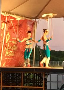 At first, the performers spun their plates as they moved in a choreographed routine, walking around each other in various formations. Soon after, the women turned their dance into a tumbling routine as one performed slow summersaults while still spinning her plates. She then handed her plates to another performer and proceeded to climb onto the shoulders of two of the other performers as they spun their plates. It was mind blowing! The crowd loved it as they cheered louder and louder with each trick. I
 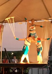 studied the plates as they appeared to wobble on the sticks. I thought that there was no way they were actually spinning these plates… they had to be attached and the performers were simply shaking the sticks to appear as though they were spinning. How else could they continue to spin their plates and hold the weight of another person, as if she weighed nothing? At the end of the performance, the women took a bow and as if they knew what I was thinking, tilted their sticks down so that the plates would tumble to the floor of the stage- proving me wrong.
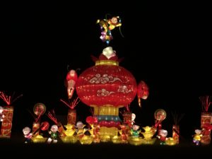
After the stage performance ended, we wandered back towards the welcome gate. Across the gravel path, in front of the pond was a lantern display that contained giant orange, pink, white, purple, and blue peony flowers with two peacocks on top of what looked like an altar. 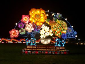 According to the informational placard next to the display, the green and orange feathered peacocks represent the embodiment of grace and talent while the elegant peonies represent grace, generosity, and forgiveness. When the artists created these two elements together, they created the ideals of luck, wealth, and happiness.
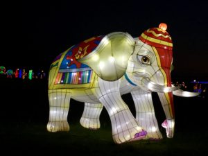 As we traveled the path around the pond, we came across life-size elephants (representing good luck), all wearing various brightly colored hats and blankets as saddles, and then a waddle of gold, brown, and white penguins that looked as if they wanted nothing more than to play with each passerby. Once passing by the penguins, we came to the front of the mighty dragon again.
The Chinese Dragon represents a spiritual symbol of all Chinese people that ties the entire Chinese nation together. As mesmerizing as the dragon was from the road and the welcome gate, nothing compared to standing at the end of the pond looking at it. From the distance, onlookers can see the orange skin and fire red scales that line its back. With a closer look, you can see that not only does the dragon have orange skin, but he has brown scales along his body. He has a mane the color of vibrant fire red and what appears to be a colorful mask around his eyes. He looks like he wants to be a vicious fire breathing dragon, the way his mouth is opened showing his bright white teeth- but his piercing blue eyes give him a comically friendly appearance. Like a puppy that wants to play fetch with his favorite ball.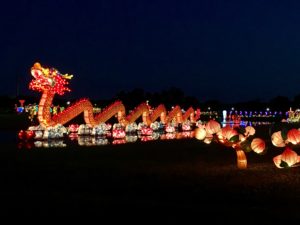
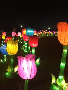
After spending time taking in the dragon and reading about its significance with in the Chinese culture, I continued to follow the path around the pond where we passed giant giraffes, zebras, and patches of flowers. All the while, every point of the pond was visible so that no matter where we looked, we were able to see the wonderful lantern displays. One of the most whimsical lantern displays was the Panda Paradise. 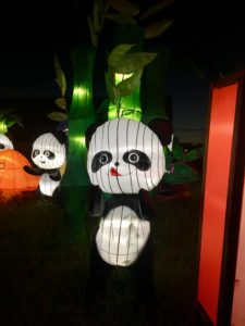 Pandas are highly treasured in China and are considered to spread the friendship of the Chinese people around the world. This display contained a group of large and small pandas playing together in a fairytale like land with mushroom housing, colorful bamboo trees, and a rainbow that they teeter tottered under. The artists that designed this display wished to show the natural beauty of pandas. Observing this display, it was hard not to smile as we constantly pointed out all the cute things each panda was doing.
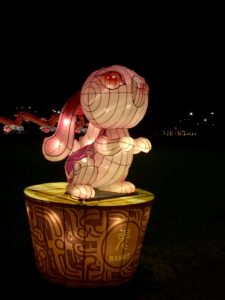
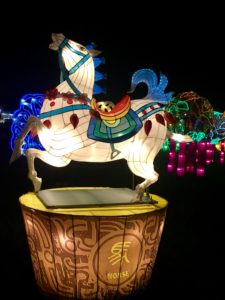
The final lantern display that we came across, as we finished our tour of the festival was the Chinese Zodiacs. Twelve larger than life zodiac animals on pedestals made up this display. Some of the lanterns in this display include a bright green and yellow dragon with a red and orange tail standing on his hind legs, a pink rabbit with long floppy ears flowing off its oversized head with large red eyes perched on its back feet, and a white horse with a blue mane and tail wearing a rainbow-colored saddle prancing around.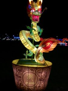
One theme that I noticed throughout the festival was the use of fish and other sea life creatures. Their representation is important because so much of the traditional Chinese culture relied on fishing for survival. The pronunciation of fish in Chinese is the same as surplus which meant people could have wealth and food for the upcoming year.
A challenge that I ran into while attending the lantern festival was the size of the crowd in attendance. Even during the last few days of the festival, the gravel path we walked along was packed with people which made it difficult to be able to stop and take notice of some of the lantern displays. I was however surprised that even though there were signs posted to stay on the path, it was not enforced. Many people (including myself) strayed off the path and walked up to many of the lanterns. This allowed for me to take a closer look at the lanterns, where I figured out that each one was made from a heavy translucent vinyl type of material. Their seams were sewn together with an upholstery grade thread. It was quite interesting to learn this, because I had no idea what they would be made out of. Having the opportunity to experience the lantern festival is one that I’m glad I took. It allowed my daughters and me to learn a little bit about a different culture than the one that we were raised in. I wish I had gone earlier during its run and attended once or twice more because I’m sure there are a lot of details that I missed that I would have enjoyed catching on later visits.